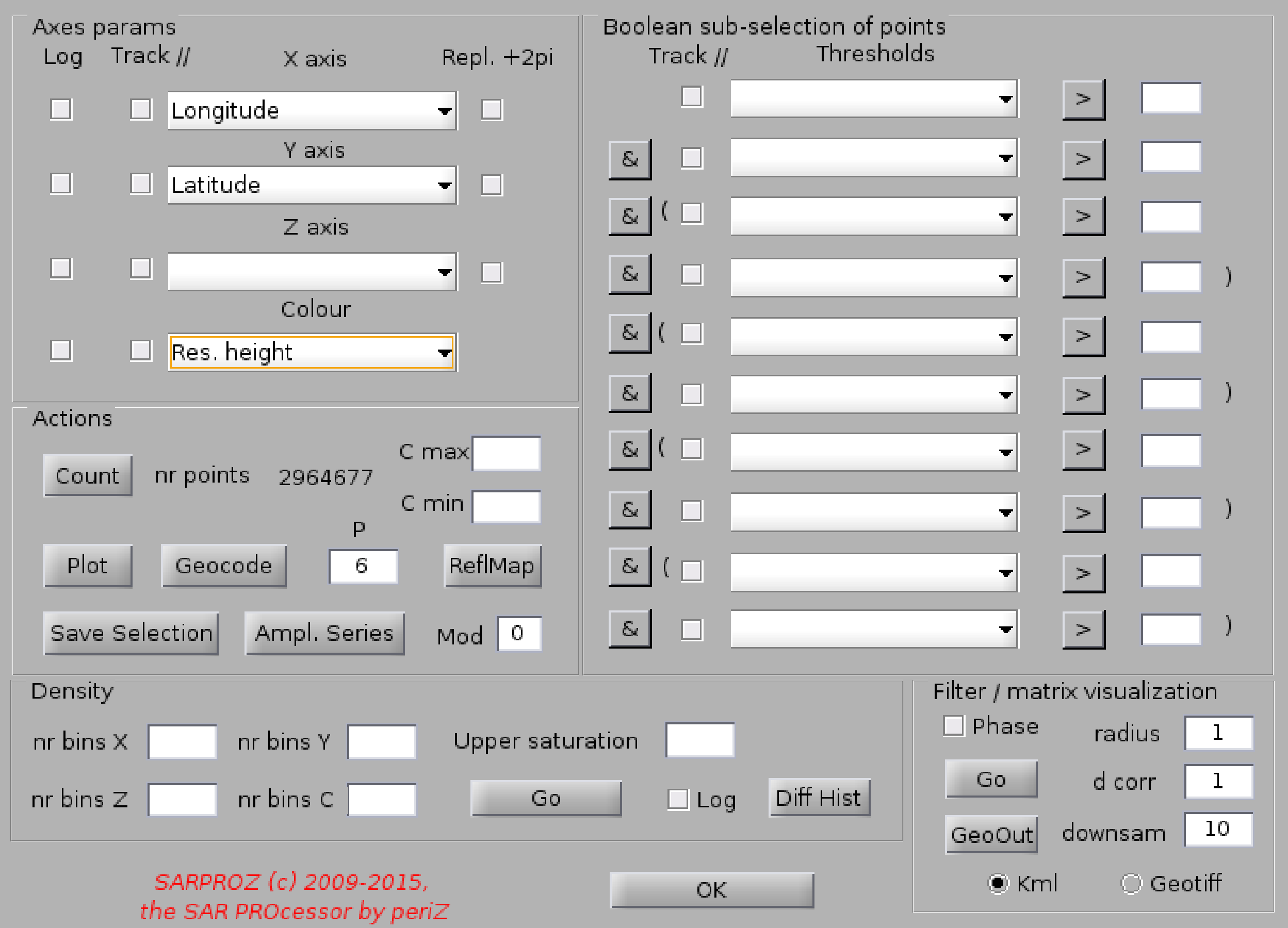
Help for Scatter Plots
With this function you can create plots of the parameters managed by SARPROZ.
For the full list of parameters managed by SARPROZ, look at "Load Mask".
Before launching this function, you have to select a sparse set of points that you want to analyze through the button
"Load Mask" in "Site processing".
You can create 2D and 3D scatter plots, colored 2D and 3D scatter plots, densities of scatter plots.
Finally, you can also visualize scatter plots in a matrix form (much quicker if you have many points to visualize).
Firstly, select the parameters to plot.
You can fill 4 axes: X, Y, Z and C, that stays for Color.
If you do not want to use one of the axes, leave it empty.
Depending on the chosen axes, a 2D or a 3D plot will be created, with or without a color code.
The plot is generate by clicking the button "Plot".
Warning: plotting many single colored points takes time. If you want to plot a colored map and if you
do not want to wait the time it takes to plot single points, check the "Filter / Matrix Visualization" auxiliary function below.
You can choose a subset of points for the plot creation
by filling the boolean selection conditions in the right columns.
Example of condition:
"Temporal coherence" > .8 & "Residual Height" < 20
In this way, all points with temporal coherence over .8 and residual height lower than 20
will be selected.
Press "Count" to apply the conditions. The number of selected points will be displayed.
By clicking on the corresponding signs, you can switch between and "&" and or "|" operators.
Note that there are pre-ordered brackets to group conditions.
Plotting Options:
You can saturate the color by the fields "C min" and "C max".
You can change the dot size through "P dim"
Auxiliary functions:
-------------------------------------------
"Geocode"
If you are displaying a parameter is SAR coordinates (Lines on X axis and sampled on Y axis), with this fucntion
you can grab the axes limits (the current displayed area) and launch automatically the small area geocoding module.
In this way, you can browse all parameters for the selected area. Advice: the area should not be too big to allow
the tool loading all results.
"ReflMap"
With this function you can plot the reflectivity map and superimpose the desired parameters on it.
To reach the aim, "X axis" must be "Lines" and "Y axis" "Samples".
"Save Selection"
You can save the selection operated with boolean expressions in a separate file and load it successively e.g from
"Load Mask".
This function will save the selection in a SAR coordinates file, samples by lines.
If a parameter on the C axis is selected, such parameter will be saved in the chosen file for the selected points.
"Plot Ampl. Series" and "Mod"
To support the amplitude time series analysis, this options has been included to display
amplitude time series for each selected point of the plot (use the Datacursor Matlab tool to select a point).
"Mod" refers to the amplitude series fitting model.
"Density"
Under this panel you can select several options to display the density of points of the scatter plot.
"Filter / Matrix Visualization"
This function is very useful for several reasons.
First of all, you can use it to resample your scatter plot in a matrix.
You can use this operation to filter and smooth your data.
Or simply for plotting quickly a dense scatter plot.
If then you choose longitude/latitude for x/y axes, you can resample your data in geographic coordinates
In such a case (if latitude and longitude are used), you can also export your plot in kml/geotiff
Options:
- downsamp -> downsampling factor (w.r.t. the plotted quantiti on x/y)
- radius -> size of the circle for filtering
- d corr -> correlation distance (2d gaussian curve calculated over the circle)